
HOUSELESS MINISTRIES
Houseless ministries is a student lead student run homeless outreach that meets every Friday night during the school semester. Every Friday Houseless prepares PB&J sandwiches bringing them to the large homeless community in downtown Knoxville. This program has been my passion for around three years and I have been leading it for the past two semesters. My life will forever be changed by my experiences serving the homeless with the quirkiest and most sincerely altruistic group of people. You may not be able to end homelessness in your community but you can bring community to the homeless. So, if you have the opportunity find some friends and be the change that you want to see in the world and in your neighborhood.
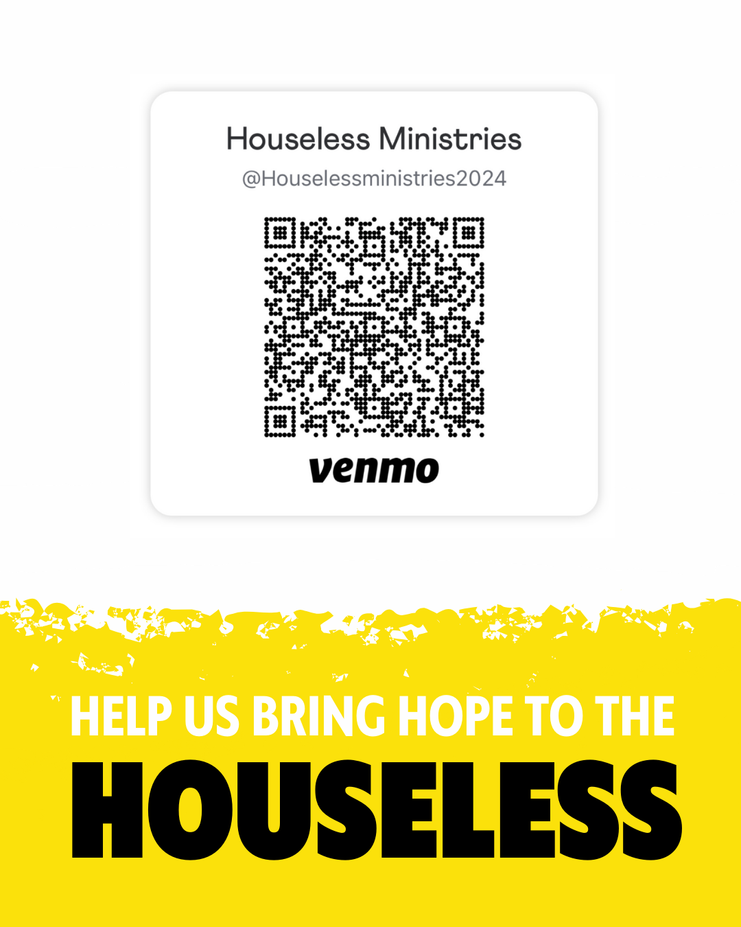
Below is the logo and promotional materials I collaborated with the team in creating.
HOUSELESS LOGO DESIGN
The original logo created several years before I joined the team featured a geometric line drawing of a house. The team agreed that this did not properly represent the program because Housless does not provide housing, and none of the program’s activities are even held in a house.
The direction I was given was to somehow sum up and unite the experience of the team that goes downtown to distribute the sandwiches with the team that stays on campus to prepare the sandwiches. With this direction it was clear that an icon featuring a PB&J sandwich would be key in accomplishing this directive.

The first panel featuring different logo designs is what I showed the team as the first pass on the logo. They voted and said they really liked #1 and wanted to explore different iterations of #8 that include a cross to emphasize that Houseless is a Christian organization.
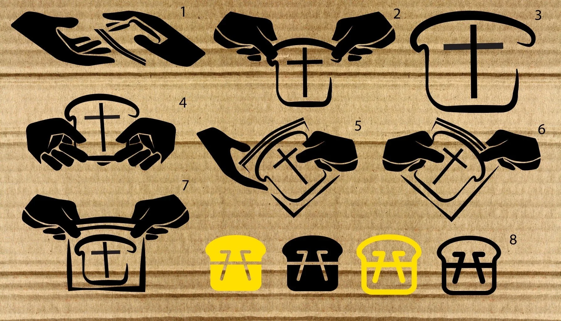
The second panel explores different versions of logo #8 on the first panel and a more refined version of logo #1. This panel split the team up and they could not decide between #3, #5, and #8. I explained the advantages and disadvantages of each logo to the team. #3 is very simple but looks a little more old school with the brush stroke lines, #5 clearly explains what the program is but would be harder to create clean looking designs for and would lock the ministry into just making sandwiches. #8 is clean modern and connects the downtown team and the sandwich prep team with the icon of a picnic table that doubles as an H, but does not have a cross.

With this summary of the logos the team was able to make a more informed decision. They decided on #8 primarily because they liked the icon of the picnic table as there are picnic tables downtown where the downtown team serve, and the food prep team always pray before heading out around a picnic table on campus.
This logo connects the downtown team to the food prep team and its rounded edges makes for a playful and happy feel that takes away some of the heaviness of the ministry. This allows the branding to appeal to first time volunteers and students looking for a community within the larger campus community.
Below is a full business set featuring the logo and elaborating on more of the look and feel of the brand.

HOUSELESS INSTAGRAM POSTS